UX Best Practices for Modern E-Learning Platforms

While value-driven content is non-negotiable for an e-learning platform, UI/UX plays a key role in shaping learning experiences. From language learning apps like Duolingo to corporate LMS like Docebo, platforms are prioritizing personalized and engaging learning paths.
With the increasing influence of UX on cognition, retention, and learner motivation, following best UX practices is paramount. In this blog, we explore the key UX principles & practices to curate an exemplary learning experience along with inspiring examples!
Why UX Matters in Modern E-learning Platforms?
Whether it’s corporate training, professional development, or K-12 learning, UX is an integral part of delivering a great learning experience.
Here’s the significance of good UX design:
-
Boosts Engagement
When an e-learning platform is easy to use and visually appealing, learners are more encouraged to achieve the learning goals. From gamification to microlearning, the new e-learning trends are making it easier to carve personalized learning paths.
-
Increased ROI
With a rich feature set and easy-to-navigate interface, users are likely to stick to the platform. Thus, it leads to higher adoption rate and increased ROI.
-
Improves Learning Outcomes & Productivity
A more personalized and accessible learning experience boosts learner retention and the ability to grasp concepts. This improves their performance and progress. For instance, a user-friendly corporate LMS streamlines the entire training process.
-
Learning Flexibility
When your e-learning platform is accessible across multiple devices and screens, it ensures seamless learning. For instance, instructors and students can switch between desktops, mobile devices, and tablets to maintain a consistent learning experience.
7 UX Best Practices for Modern E-Learning Platform
Designing the best UX design for e-learning involves a good understanding of the user’s needs, technical skills, and the right instructional design choices.
Now, let’s take a look at the best UX practices for your e-learning platform!
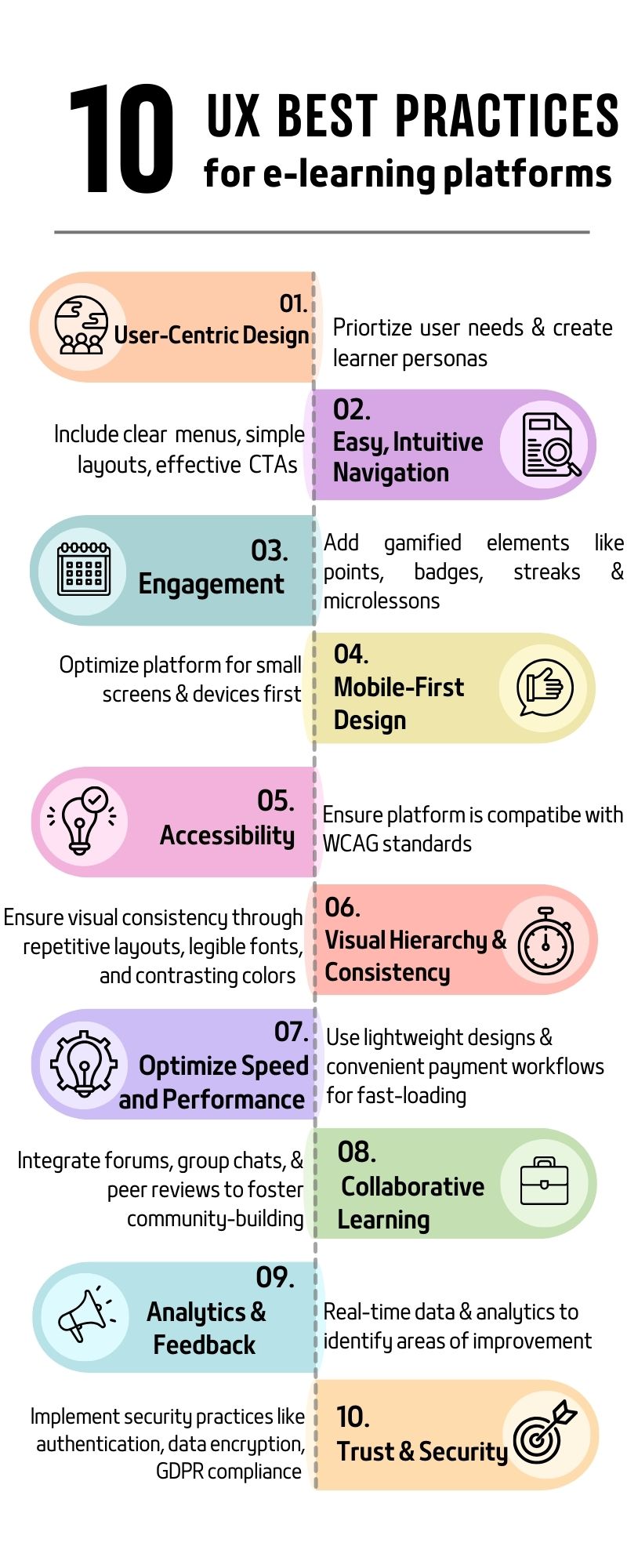
1. Adopting an User-Centric Design
The first step to making your design intuitive is prioritizing the user’s needs. Hence, designers must consider the feedback of instructors, learners, and administrators to build an e-learning platform that resonates with users.
Craft detailed user personas for each of these entities. Consider points like user needs, skills, training goals, demographics, etc.
Ask questions like:
- What are the needs and challenges of students?
- How to make the lessons and courses more interactive?
- Do students expect personalized learning paths?
Collect data from surveys, interviews, and usability testing to collect essential points. For instance, a new employee has starkly different needs compared to a K-12 student.
A good user design leads to greater user satisfaction and engagement. On the other hand, a poor user design leads to frustration and platform abandonment. An e-learning platform would be used by diverse types of learners and might need different features.
You need to consider the learner’s style, knowledge, and preferences. For example, integrate multimedia like video and images for visual learners.
1. Easy, Intuitive Navigation
The main purpose of e-learning platforms is not only to provide educational content, but also to guide the learners. Create enriching learning experiences that align with learner behaviour. This makes learning more engaging and enjoyable.
Imagine an e-learning platform with a clunky interface and confusing layout. There are no clear labels or buttons like “Next” and “Back”; users feel like they are lost in a maze. When learners don’t know the next step, they are sure to look for an e-learning platform with better UI.
“The more choices a person has, the longer it takes to make decisions.”
-Hick’s Law
Here are key considerations for creating an intuitive navigation:
- Clear, concise menus for navigation, attribute selection, or form filling.
- Call-to-action menus like “next” or “back” that guide users through modules, pages, or purchases
- Implement a course map to guide users through your website
- Clear pagination involves splitting your course into smaller groups for easier access.
- Choose simple and consistent layouts so learners focus on learning.
A clear and simple navigation reduces friction between users and the platform!
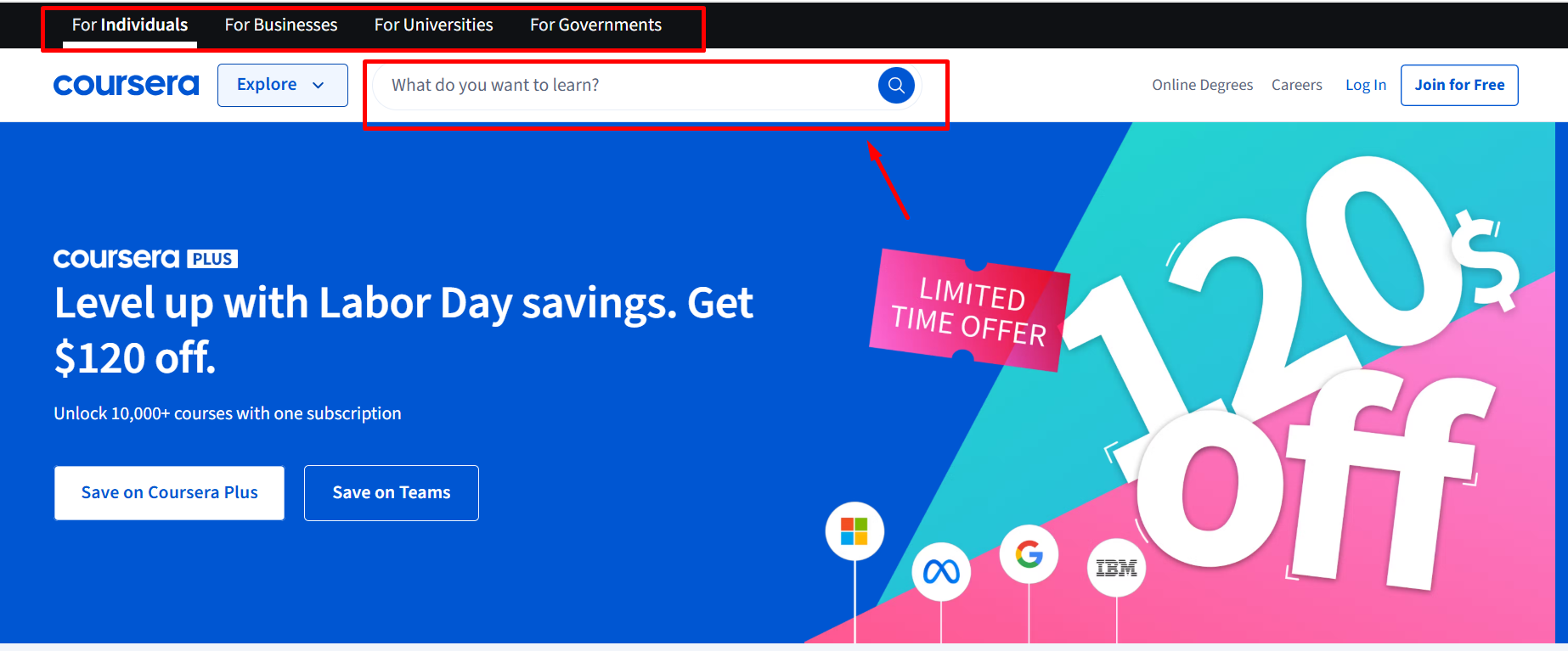
Coursera’s easy and intuitive navigational interface helps learners to quickly discover courses
2. Include Engagement Features
One of the biggest challenges is to make learning engaging & interactive. Modern trends like gamification and micro-learning ensure more engaging learning experiences.
Consider learning on a language app like Duolingo. Learners glued to streak challenges, daily goals, XP and levels, badges, infuse a game-like experience rather than a chore.
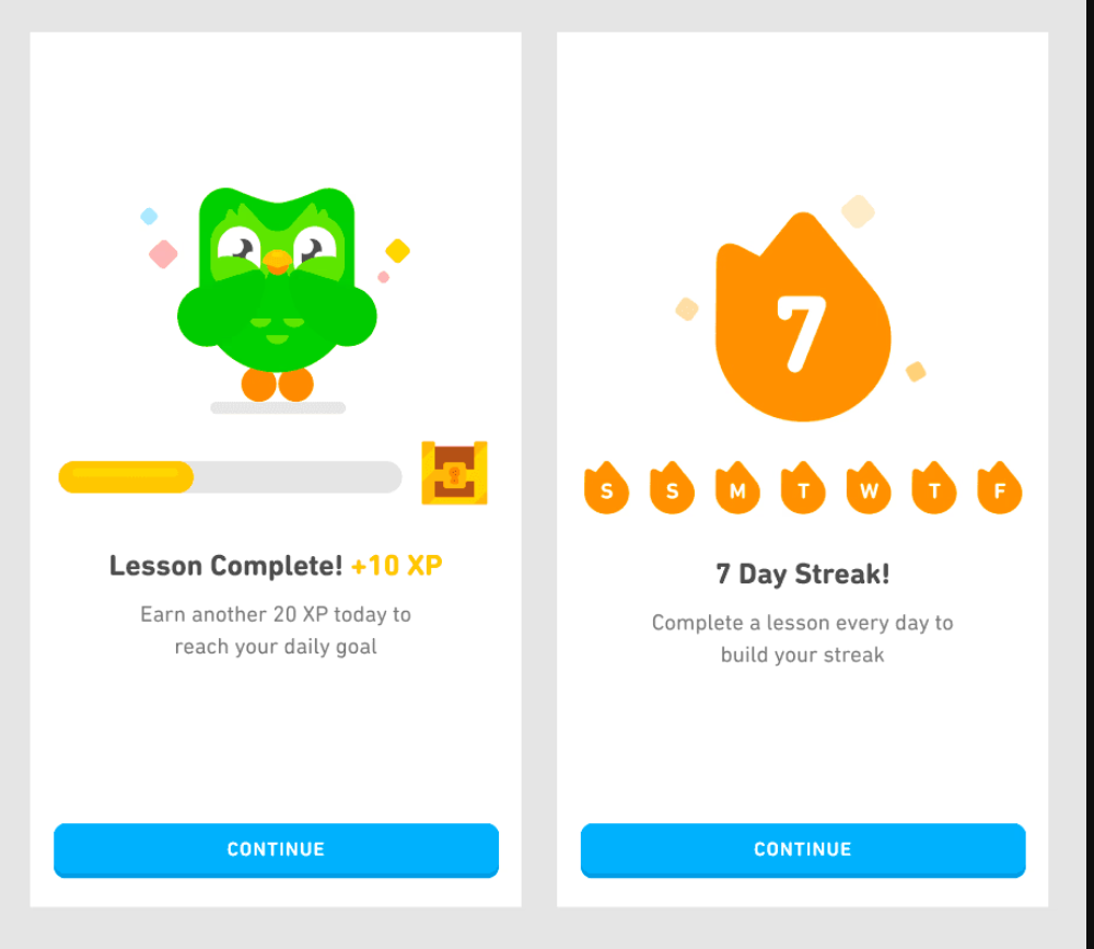
Duolingo 7-Day Streak Challenge makes language learning fun and interactive
Here are some strategies to make learning more engaging:
- Multimedia & interactivity: Use a mix of videos, interactive quizzes, audio prompts, and drag-and-drop tasks to offer an all-around learning experience.
- Bite-sized learning: Breakdown lessons into smaller chunks, so they can easily absorb information. Micro-lessons are easier to learn and retain information.
- Personalized learning paths: Each learner has unique learning needs and preferences. Using analytics & AI learning paths helps to carve learning paths based on user needs, demographics, preferences, etc. Language learning apps could use some assessments to determine the proficiency level of learners, then tailor the modules & lessons accordingly.
- Gamification & micro-interactions: Integrating game design & principles into non-gaming contexts makes learning more interactive. The goal is to create the dopamine effect that incentives and motivates learners to stick to their learning paths.
3. Prioritize Mobile-First & Responsive Design
A large number of learners take lessons from their phones for convenience. Hence, adopting a mobile-first approach is non-negotiable today.
It’s pragmatic to think — what works for desktop, also works for mobile. But designing for mobiles demands a different strategy.
Design for smaller screens first, then you can later optimize it for normal screens. E-learning platforms should adopt a responsive design to adapt seamlessly across various devices and screen sizes.
Key strategies for a mobile-friendly design:
- Flexible layouts & content formats: Look for mobile-compatible content formats like infographics, interactive elements, or videos. Using a similar and flexible layout ensures all the content gets automatically rearranged based on screen size.
- Scalable images: This ensures that images retain clarity on both smaller and larger screens.
- Offline access: Offline access or a feature to download courses ensures a seamless learning experience across small screens.
- Optimize the space usage: Minimize on-screen distractions with unwanted buttons, logos, and banners. For maximum accessibility, find the touch targets based on how users hold their mobile devices differently.
This ensures a more inclusive learning experience and avoids the hassles of retrofitting desktop content.
4. Emphasize on Accessibility
Another core principle of UX design is accessibility. Every e-learning platform has to adhere to the WCAG (Web Content Accessibility Guidelines) to make its platform accessible to all, even people with disabilities.
These guidelines ensure that your platform follows four key principles: robust, perceivable, operable, and understandable.
Universal design is the new standard for e-learning platforms. This means one design that fits all the learners.
Implement the following tips to make your platform accessible to all:
- Perceivable: Provide alt text for images and non-text content, so screen readers can easily describe them. Incorporate captions and transcripts for audios and videos. Check the color contrast to ensure it’s visible to people with visual impairments.
- Operable – Ensure all interactions and functionalities are accessible through keyboard. Check whether drag-and-drop activities, interactive content, carousels, buttons, and links are operable through assistive technology. Screen readers, voice browsers, and Braille displays are a few technologies.
- Understandable – Use simple language and avoid jargon, so that users don’t need any technical expertise to use your platform. Maintain a standard template and consistent layout to avoid any cognitive overload and confusion.
- Robust- This means the applications must be compatible with different kinds of assistive technologies, browsers, and operating systems. Use standard HTML/CSS that’s easily interpreted by different browsers and assistive tools.
5. Visual Hierarchy & Consistency
Along with curating a compelling learning narrative, a powerful learning platform takes its users through a visual journey. Starting from the most important element to the least relevant one, without distracting from the core message.
This involves reinforcing pedagogy through different visual aspects — visual elements, images, and even spaces.
“Users perceive similar elements as being related or forming a complete group or pattern.”
-Gestalt Principle of Design
Here are the key elements to create a strong visual hierarchy:
-
Size & Typography
Use font size & typography to ensure contextual & visual relevance. You could use different font sizes for headings, subheadings, and body text. Also, use legible fonts like Sans Serif fonts like Robota and Futura that are readable.
-
Color
Color is a dynamic tool that taps into the user’s psychology. Colors are known to evoke vivid emotions. From calm backdrops to trustworthy hues, colors support visual symmetry and usability. Choose 2-3 colors to add emphasis and send visual cues. Preferably, use high-contrast color schemes that complement but don’t jar the eye!
-
Repetitive Icon & Imagery
Maintaining a cohesive experience across course menus, icons, buttons, & layouts makes learning intuitive. When you maintain a consistent look-and-feel across the platform, it steepens the learning curve. Don’t use too many typefaces, or change the style of your buttons or icons.
6. Ensure Optimum Speed and Performance
Modern learning systems focus on defining an engaging and interactive learning narrative. But that shouldn’t come at the cost of your platform’s performance!
While multimedia elements like videos, images, and infographics improve learning, they are often clunky. This hinders the fast loading and speed of your e-learning platform.
But, ideally, your learning platform must be up and running in different scenarios. For example, course marketplaces like Coursera and Udemy might encounter high user traffic or host large volumes of courses. But maintaining optimal performance ensures a smooth learning experience.
Here are performance optimization strategies for e-learning platforms:
-
Optimize Media
Use compressed images & minimize file sizes to tackle slow-loading and memory issues
-
Implement CDN Network
Store content in a global network of servers to reduce latency issues. Maintain cache for frequently accessed videos, courses & quizzes.
-
Effective Login & Payment Workflows
Provide a user-friendly login and onboarding experience with minimal steps. Auto-save learner’s course or task progress to avoid losing work between session timeouts. Ensure payment verifications are quick, convenient and secure.
-
Focus on Lightweight Design.
Adopt a clean and structured design optimized for HTML & CSS. Overload of information and resource-intensive multimedia leads to slow loading.
7. Social & Collaborative Learning
Whether it’s discussion forums, peer-to-peer learning, or collaborative learning, all offer an engaging learning experience. Collaborative spaces have dedicated community spaces like forums, chat groups, or breakout rooms.
Members of a learning community typically ask questions, share knowledge, celebrate wins, and support each other. Including a shared community or dedicated space in your e-learning platform to improve engagement, motivation, and networking opportunities.
Key Strategies for Collaborative learning:
-
- Incorporate group projects, discussion forums, and peer-to-peer reviews in your learning platform
- Connect with communication tools like chats, private chat, and video conferencing tools for real-time and asynchronous communication.
- Ensure screen-sharing, file exchange, and project management tools for knowledge-sharing
- Gamify & reward your members with badges, leaderboards, & points. Highlight contributions with top contributor badges in forums.
- Host collaborative challenges, contests & celebrate group milestones
For example, the Italki community is an exclusive community for learners & native speakers where they can connect through forums, Q&A, and exercises.
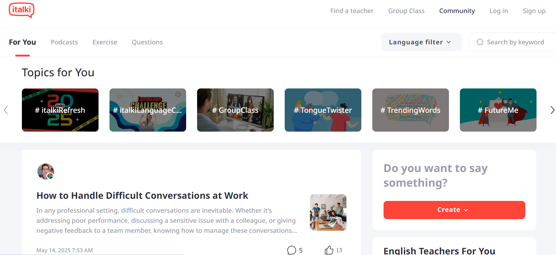
Italki Community is a dedicated space for learners to share, support and grow as learners.
8. Analytics & Feedback Mechanisms
A powerful e-learning platform doesn’t just offer great educational content but data-driven insights on how learners are progressing. Real-time feedback & analysis help to identify whether students are progressing and areas of improvement.
So, how does analytics help learners? It helps to identify patterns, trends and relations, offering valuable insights to enhance the learning experience.
Student dashboards include progress bars indicating course progress. Completed modules, time spent on the course, and scores are metrics captured by the dashboard.
Along with learning analytics, the instructor dashboard offers actionable insights on course earnings & learner progress. This includes engagement metrics like quiz results, drop-off points, and activity heatmaps.
By considering these insights, instructors can design an engaging and interactive course that resonates with learners. In fact, predictive analytics helps anticipate learner behaviour and performance and helps struggling students and predict drop-outs.
Feedback loops in courses can turn passive courses into an active learning experience. Integrate quiz, assignments, email feedback, gamification cues like badges, points, and leaderboards as gentle nudges..
9. Data Privacy, Trust & Security
Safeguarding the privacy & security of e-learning platforms is one of the essential UX practices.
E-learning platforms frequently collect personal & sensitive information, such as name, IP, email address, contact details, etc. Besides, these platforms also collect details like course progress, time spent on the course, scores, etc.
However, cybersecurity threats and data breach could expose all the essential data.
Key data security practices for e-learning platforms:
- Consider user consent and ensure transparency about data collection, storage and management
- Adhere to data protection laws like GDPR and FERPA for data collection, storage, and management
- Employ robust security measures like two-factor authentication, encryption, and antivirus software
- Perform regular security audits to identify and address platform vulnerabilities
Conclusion
The role of UX extends beyond aesthetics and surface-level design, influencing pedagogy, technology, and cognition. A well-designed interface reduces friction and confusion in terms of user interactions.
E-learning platforms are continuously evolving with advancements in technology & knowledge-sharing practices. When platforms prioritize a user-centric approach, mobile-first design, visual hierarchy & user feedback, they foster ideal learning environments.
Follow these 10 best UX practices to unlock the full potential of learners and your business!
FAQ-Related to UX Best Practices for Modern E-Learning Platforms
1. What are the key UX principles for modern e-learning platforms?
The key UX principles for a modern e-learning platform are:
- Prioritizing a user-centric approach
- Easy, intuitive navigation
- Making learning more engaging and interactive
- Adopting a mobile-first approach
- Emphasizing Accessibility
- Performance & Speed Optimization
- Visual Hierarchy & Consistency
- Perform User Testing & Continuous Improvement
2. What role does personalization play in e-learning platforms?
Personalization tailors learning to an individual’s needs, strengths, weak spots and preferences. This significantly improves their overall retention, outcome, and performance.
3. What accessibility practices should I follow for my e-learning platform?
E-learning platforms must follow the WCAG standards to make learning accessible to all.
There are four key WCAG principles:
- Understandable – Learners should be able to understand the content and interface well.
- Perceivable – The educational content must be accessible by learners, regardless of any disability or impairments in vision, hearing or touch.
- Operable – Learners must be able to perform all the actions on the platform. For example, providing keyboard-only navigation options for all the interactions.
- Robust – All your platform interactions and content must make sense to assistive technologies.