How to Structure a Student Dashboard That Drives Engagement?

Struggling to decide what’s perfect for your dashboard? Numbers, visualizations, alerts or warnings? A learning dashboard is a powerful tool to measure if learners are crushing their goals.
There’s a lot of information on your learning platform. Building a robust dashboard means distinguishing the essential from the visual noise. Along with conveying the metrics, design also matters! A poor design often makes your data less comprehensible.
In this blog, we cover metrics, steps to structure a dashboard, and key design principles to get started.
So, let’s dive in!
What are the Metrics for the Student Dashboard?
An educational solution should allow teachers and administrators to track learners’ progress. Only when they evaluate their educational software can they determine its effectiveness.
Here are the key metrics to include in your student dashboard:
-
Assessment Scores
Want to test your student’s mastery on specific subjects? Monitor scores on quizzes, tests, and exams, and score trends to understand how far learners have progressed.
-
Learning Grades
Learning grades show how proficient students are in a specific subject. Track GPAs, average test scores, and standardized scores on your dashboard.
-
Enrollment Rates
Are courses on your platform gaining enough traction? Look at the enrollment rates to see if learners resonate with them. Track metrics like total enrollment, enrollment growth rate, and demographic breakdown of enrollment. Includes demographic, age, and location in the breakdown.
-
Courses Completed
Keeping learners motivated enhances their learning outcomes. You can either display a text-based or visual progress of course completion. Enable percentage activity competition to display lesson, quiz, or assignment progress.
-
Learner Engagement
Engagement and interaction keep learners glued to your edtech software. Learning time spent, course completion, and participation levels help to gauge learner engagement.
-
Student Satisfaction
Learner satisfaction is another key metric on the student dashboard. Students can offer feedback on the course quality, tutoring approach, etc. Include user feedback, surveys, and course evaluations to collect platform feedback.
-
Achievements & Gamification
If you own a gamified learning platform, flaunt your learners’ achievements. Set up game mechanics like XP points, leaderboards, badges, certifications, etc.
The metrics vary based on the type of your learning platform. Further, consider factors like institutional goals, actionability, and stakeholder relevance.
7 Steps to Structure a Student Dashboard that Drives Engagement
The basic goal of the student dashboard is to capture complex information in a simple form. Bad design, unclear visualization, or wrong metrics are a turn-off for students.
Here are the steps to structure an actionable student dashboard:
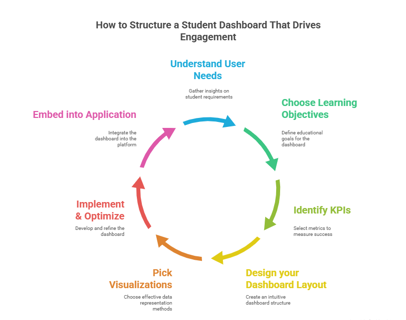
Step 1: Understand User Needs
The first step is to dig deeper into your target audiences’ needs. This involves getting a comprehensive understanding of learner needs, behaviour, and software interactions. Also, get an idea of their problems and what they expect from your dashboard.
Every data set is unique for a different set of audiences. Hence, you need to adapt to the needs of the audience.
For example, if you own a course platform, users might expect to track course completion rates and learner engagement rates.
Based on the analysis, plan the metrics required and design the dashboard. This helps to customize the workflow of your software.
Step 2: Choose Learning Objectives for Dashboard
After choosing a specific skill, behaviour, or action, decide the questions that you want your dashboard to answer.
Based on these, define your learning objectives.
Here are some questions your dashboard could answer:
- What are my learning grades?
- What’s the time spent on learning materials?
- What are the areas where I excel and need improvement?
- Which materials do I find engaging the most?
- How did I contribute to my class discussions or activities?
- How satisfied am I with the quality of courses and teachers?
- What are my goals and achievements?
Step 3: Identify Key Performance Indicators for your Dashboard
Now that you have determined the objectives that your dashboard would answer. It’s time you find KPIs to measure them.
Your KPIs are actionable metrics to track your learning objectives. There are different metrics your dashboard could track. We have covered most of them earlier.
Ask yourself: which metric matters most?
Choose the ones that better define your business narrative. You don’t need to track everything. This leaves an overwhelming amount of information for your learners.
For instance, performance improvement and training ROI are important for an L&D software. But it’s not essential for a course platform.
Follow these tips while choosing your KPIs:
- Align with your business goals and objectives
- Select KPIs that are relevant and offer actionable insights
- Ensure your KPIs are consistent and reliable
- Employ quantitative and qualitative KPIs for a comprehensive understanding
Ensure you collect data from relevant data sources. This could be different sources like Student Information System (SIS), Learning Management System (LMS), assessment platforms, etc.
Find out if all these systems are well-integrated and provide you with what you actually need.
Step 4: Design your Dashboard Layout
Your dashboard isn’t just a collection of numbers and figures.
It narrates a story!
About your learners’ performance, pain points, and needs.
Besides, it keeps your users engaged and guides them to make informed decisions.
Keep these points in mind when designing your dashboard:
- Design an easy and intuitive dashboard for your users.
- Display only the essential details at the top of your dashboard.
- Keep it simple and strip away what doesn’t add value
- Use clear visual indicators (green for positive trends and red for warnings or shortfalls)
- Keep the essential metrics big and the additional details small.
- Use one primary color to highlight the key details . Adding too many colors can make it noisy.
- Create a visual hierarchy with a Z-pattern for natural eye movement (from top-left to top-right and diagonally down to bottom-right).
- Use labels along with colours to increase web accessibility
- Use click-to-filter, drill downs and animations for interactivity
💡Tip: If your dashboard is hard to understand, then it’s time you restructure it. Use the five-second rule to understand if your dashboard offers all the relevant information in the first five 5 seconds.
Step 5: Pick Visualizations
Imagine scrolling through walls of boring figures and information. It’s frustrating when learners cannot digest your data.
Graphs and charts break down the information. Moreover, it easily depicts trends and patterns. Users can hover over the visualizations to discover essential details.
If your visualization is important, ensure it gets enough space.
Here are possible visualizations for different metrics:
- Academic Progress – Bar charts, line graphs, progress bar
- Attendance – Heatmap, pie chart
- Assignments – Bar chart, timeline
- Grade Distribution – Bar chart, box plot
- Course Management – Course calendars, usage dashboard
So, how do you choose the right visualization?
Tabular format is right when the actual figures are known. Line charts are right to visualize data over time. Alternatively, bar charts and pie charts are ideal for comparisons.
Want to show geographical representation of data? Heatmaps can do the work for you. They capture powerful visual representations.
Choose based on your metrics, data availability and design.
Step 6: Implement & Optimize Dashboard
Once you have created a clear design of the dashboard, build the dashboard. Pick a tool to build your dashboard.
Here are some popular tools for building a dashboard:
-
PowerBI
PowerBI is a cloud-based or web-based dashboard analytics that easily integrates with third-party sources. From real-time dashboards to interactive reports, Power BI includes a whole range of visualization types. Businesses can easily track, analyze, and share business data.
Features: SQL analysis, Q&A interface, third-party integration
-
Tableau
Another popular tool that displays easy-to-digest data is Tableau. It supports data blending, real-time data analysis, and data collaboration. Besides, you can easily handle large and complex data sets with the tool.
Features: Data blending, real-time data analysis, data collaboration
-
Google Analytics
With an interesting mix of basic and statistical analytical tools, Google Analytics is a popular dashboard tool. It tracks conversions, engagement, user traffic, customer behaviour, order value, etc.
Features: Predictive analytics, intelligence, anomaly detection
-
Databox
Databox is another cloud-based business analytics platform for data-driven insights and KPIs. It’s perfect for third-party integrations with Salesforce, Hubspot, and Facebook Ads.
Features: Drag-and-drop interface, flexible reporting, data connectors
Step 7: Embed Dashboard into Application
Finally, embed the dashboard into your application or web portal. Ensure your dashboard is optimized for integration.
So, here the goal is to combine two separate software pieces into a cohesive piece.
The different ways to embed your dashboard are:
- Using Iframe/ Javascript embed scripts
- LMS Plug-in based integration with APIs
- Custom-built dashboard (using React, Angular, Vue)
When using the iframe method, get the embed code and insert it into your HTML code. Typically, the code is inserted inside the HTML iframe or JavaScript code snippet.
If you’re using Moodle, Canvas, or Blackboard, embed it using HTML blocks or REST APIs. For a custom platform, you need to fetch data using internal APIs.
Here’s a checklist before embedding your code:
- Test your code on student devices and browsers
- Check if you’re collecting data from secure sources that adhere to privacy policies
- Verify access & security filters
- Check for mobile-responsiveness and test on different screens
- Provide an easy and intuitive platform experience
The best dashboards need work if they aren’t relevant to users. So, focus on iterating feedback loops and refine your dashboard. Adjust visualizations and data points as per evolving business needs.
5 Design Principles for Creating Better Dashboards
So, what’s the secret formula for a great design? Each dashboard has unique requirements and goals.
Follow these principles to improve your design dramatically:
-
5-Second Rule
Your dashboard must convey the essential information within 5 seconds. People typically scan information, so 5-second is time you get the convey to stakeholders.
-
Clarity
Overload of information, vague data and visualizations confuse users. So, aim for a clean and concise design that provides essential information.
-
Logical Layout
Follow some organizing principle while designing your dashboard. Provide the key information at the top, trends in middle, and supporting details at bottom. The Inverted pyramid and Z-pattern are the most common design layouts.
-
Minimalism
Less is more; keeps your visual clutter at bay. The human brain can process around 7 images per second. So, don’t include more than 5-9 visualizations in your dashboard. Avoid visual noise with filters and hierarchies.
-
Actionability
A good dashboard empowers learners and stakeholders to make informed decisions. For instance, a low assessment score means learners need to ramp up their preparation. Poor reviews on teaching quality, means platforms need to onboard expert tutors.
Key Takeaways
- Your student dashboard must be user-centric and goal-driven to make smarter decisions.
- Start with user needs and goals. Determine the right metrics based on learning objectives.
- Apply effective design principles to create a user-friendly and intuitive dashboard.
- Choose visualizations that capture your business scenario and offer pictorial representation. Determine an appropriate visualization that integrates well with your existing system.
- Finally, design a dashboard that not only evaluates learning, but makes a business impact
So, are you planning to design personalized learning paths? Build your learning business with Pinlearn minus the coding hassles. From dedicated user dashboards to analytics, you’ll find your go-to-learning solution. So, book your 5-min free call with our experts today!
FAQ-Related to How to Structure a Student Dashboard That Drives Engagement
1. How to create a student dashboard?
Following are the steps to structure a student dashboard:
- Understand User Needs
- Choose the Learning Objectives for Dashboard
- Identify KPIs for your dashboard
- Design your student dashboard layout
- Pick Visualizations and Graphs for your dashboard
- Implement & optimize your dashboard
- Embed the Dashboard into your application
2. How can I track progress on the student dashboard?
Use course completion rate, lessons and modules, tasks or quizzes for progress tracking. Include milestones, badges, and rewards to indicate learner progress.
3. What are three main aspects of designing a dashboard?
Consider the following aspects when designing dashboard:
- Numbers – Determine the right metrics for your dashboard
- Visuals – Represent your data and insights through right visualizations
- UX and Layout – An effective pattern to arrange the data and visuals
4. What are the key metrics to track in the student dashboard?
Below are the key metrics to track in the student dashboard:
- Course Progress
- Enrollment Rates
- Learner Performance (Scores & Grades)
- Learner Engagement
- Achievements & Gamification
- Instructor Feedback
- Student Satisfaction